Hello friends!
Today I would like to share with you how I put together my Love This layout. This layout was made with the October Creative Kit from My Creative Scrapbook and features the super adorable Forest Friends collection from Doodlebug.
I'm not really into the Pocket Style of scrapbooking for the most part, but sometimes the simple style of it appeals to me. Rather than use a page protector with pockets, I just adapted the style to fit on a typical 12x12 page so it would fit in my regular sleeves.
The Jillibean cards in the kit work perfectly for this style of scrapbooking. They are the perfect size.
I layered some patterned papers in the negative spaces on the card to create my title, and then layered the heart sticker over the arrow. Now of course I can't have things too linear or flat so I offset the sticker of the flower on the card and popped it up with a pop dot. I added the little tag of ribbon to add some texture.
I layered some patterned papers in the negative spaces on the card to create my title, and then layered the heart sticker over the arrow. Now of course I can't have things too linear or flat so I offset the sticker of the flower on the card and popped it up with a pop dot. I added the little tag of ribbon to add some texture.
I used one of the small flowers from the kit to create an embellishment cluster in the center of the layout. The flowers are actually two layers glued together, but I carefully took the layers apart and used just one flower on this layout. I used the other on a different layout. I tucked the owl sticker under a button and used a pop dot under the sticker to add a bit more depth and dimension there.
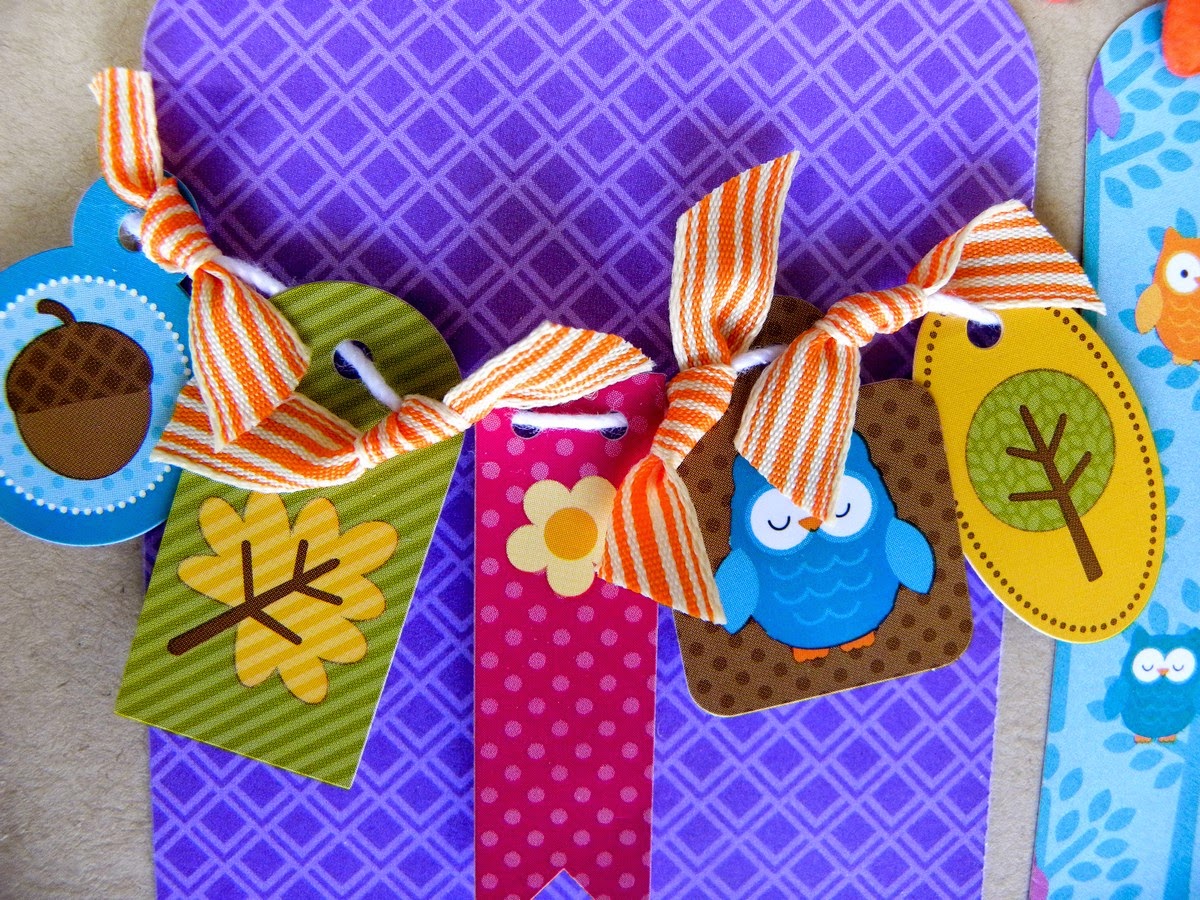
The is my favorite part of my layout. I wrapped a piece of string around the purple card I cut and strung a bunch of the little tag stickers onto the string. I put a pop dot under each (I love pop dots! I can never leave stickers flat). then I tied a little piece of the orange ribbon from the kit in between each of the tags.
..it's super adorable.
Finally I loved the circle/bubble card in the kit so I added it in the last section. I liked how the white cards are on opposite corners of the page. It helps to create balance.
And again, I just can't have things too linear so I offset the cute little owl journaling sticker and added a button for dimension.
So that's it from me today....
Hope that list gave you some ideas for your next project!
Thanks for stopping in today!
~Becky
Visit my BLOG


